Data Visualization
Recitation Media Piece

Data Visualization Objective:
Develop your own data visualization that accurately represents the data and effectively conveys information.
Recitation (the 50-minute activity) attendance is not required, but you are welcome to use that class time as office hours to ask your GTA questions, or study with classmates in 127 Weniger.

Background Information on data visualizations is introduced as part of the Human Population webpage in this week’s Habitat guide.
Assignment (due Sunday on Canvas)
Data Visualization
For this media assignment, you are producing a data visualization. This could be your own data or data from a research source The data needs to be related to some type of natural phenomenon. For example, you could use weather data, the number of hours an animal is active, calories in a daily diet, number of sleep hours, the size of populations in different areas, etc. If you would like to work with human population data, you can use data from the Population Reference Bureau prb.org or other sources like the United Nations, etc. If you use data from a source, cite the source with its name, website address, or other identifiers.
Your data visualization needs to:
-
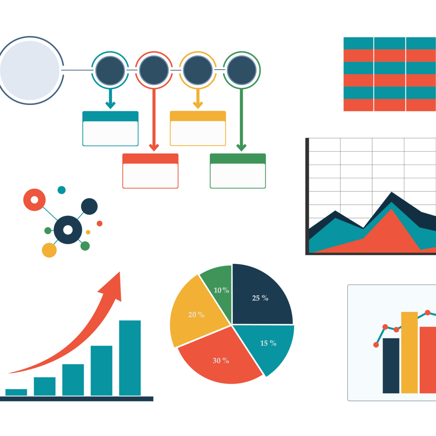
be in a figure format that you feel accurately represents the data. This could be a line chart, bar chart, scatterplot, pie chart, histogram, cartogram (map), or something less conventional.
-
clearly present the data with a title, labels, and/or key as needed.
-
have an engaging design that captures attention. This could be color, patterns, texture, 3D modeling, a witty shape, or whatever you create.
This could be a strong addition to your final portfolio representing a skills outcome.


